Top 11 Tips To Improve Your Graphic Design
- 1 Our top 11 tips to boost your Graphic design
- 1.1 1st Tip To Boost Graphic Design – Watch the fonts:
- 1.2 2nd Tip To Boost Graphic Design – Spacing is critical:
- 1.3 3rd Tip To Boost Your Graphic Designing – Color palette:
- 1.4 4th Tip To Improve Graphic Designing Skills – Alignment:
- 1.5 5th Tip To Improvise Graphic Skills – Symmetry:
- 1.6 6th Tip To Uplift skills for graphic designing – Contrast:
- 1.7 7th Tip for enhancing Graphic Designing – White space:
- 1.8 8th Tip To nurture the Graphic Design skills – Research:
- 1.9 9th Tip To heighten up Graphic Design expertise – Moodboards:
- 1.10 10th Tip To Uplift Graphic Designing Mastery – Write it down! :
- 1.11 11th Tip To increase Graphic Designing expertise – The KISS principle:
Are you just starting in graphic design? Or are you a pro but in desperate need of inspiration? Or maybe you’re looking to boost your marketing strategy via graphics? Don’t worry we’ve got all of you covered.
Our top 11 tips to boost your Graphic design
Designing can become complicated pretty quickly, but it doesn’t have to be. Take it back to basics with our 11 Tips to boost graphic design
1st Tip To Boost Graphic Design – Watch the fonts:
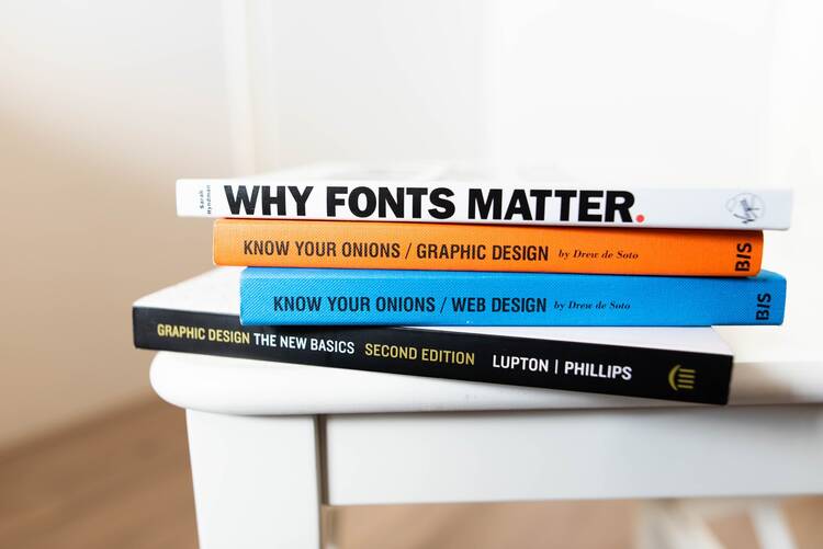
Do not go ham on the fonts. Use very little to convey the most. When picking fonts for your heading, subheadings, and body, remember to make sure they are easily legible. More often than not, your fonts may be readable, but they’re too small and are only visible when you zoom in; avoid this at all costs. In the same vein, play with fonts that are in the same group; you can then play around with bolds and italics to make it pop! Remember that fonts set the tone for your content, and hard-edged fonts like sans serif fonts give off a formal vibe.
2nd Tip To Boost Graphic Design – Spacing is critical:
You might have a lot of text in your design, but by using the proper spacing, you can make it pleasing. If a word or body of text takes too much space, use text alignments to bring it down and vice versa. Do not be afraid to play around with font sizes to create an informal hierarchy of text; it is much easier for the eye to read. Now, spacing is probably the most tedious thing to take care of in a design, so if your design is multi-page, it would be easier for you to duplicate your design and then replace elements as needed rather than create it all over again. Remember, work smart, not hard.
3rd Tip To Boost Your Graphic Designing – Color palette:
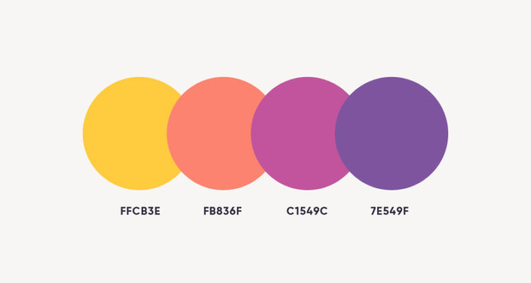
Colors like fonts are one of the critical elements that will set the tone for your design. Before you start your design, take some time to play around with colors and make a palette in your workspace. This will allow you to use colors and easily duplicate them if necessary. To finesse your design, pick one color and use tints and hues of the same to take it to the next level. It is recommended that you choose a scheme that has 1-3 primary colors and various other colors to complement them.
4th Tip To Improve Graphic Designing Skills – Alignment:
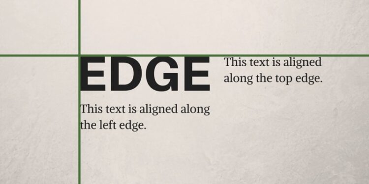
If you want sleek and polished, a precise alignment is your best friend. Use elements like lines, borders, and margins to offset your body of text. The same goes for images. Don’t just place them anywhere haphazardly; use a layout. Both your text and images are equally important. Remember to align them in a way that would subtly lead the eye.
5th Tip To Improvise Graphic Skills – Symmetry:
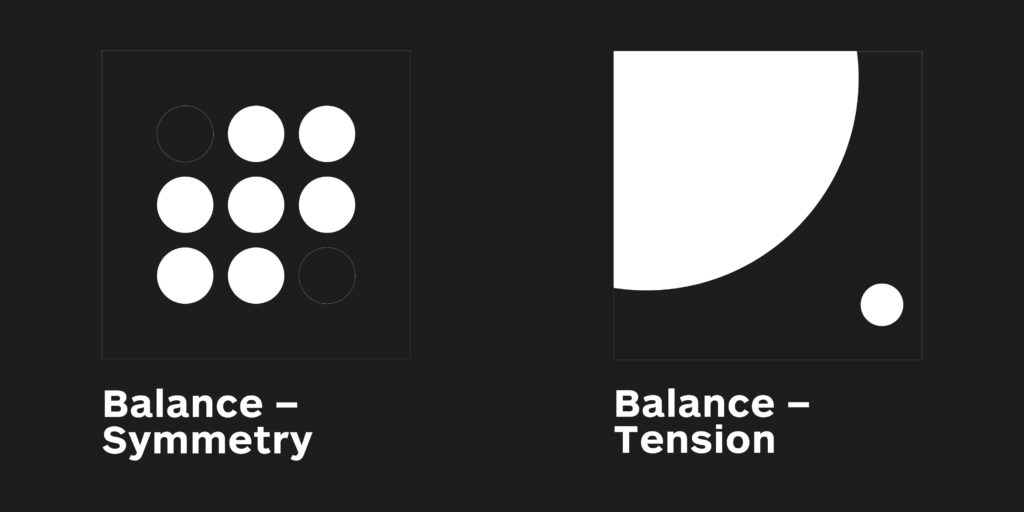
Symmetry is not the same as alignment. You can break the rules of symmetry every once in a while, but you can’t do that with alignment. Do not underestimate the power of symmetry, though. If your design is minimal and does not have too many elements in it, make sure your design is placed in the folds, i.e., centerfold or to one side in the center or top corners. Use the rule of thirds here, especially if the design is minimal because it is very off-putting to look at designs that are just slightly off-center.
Bonus: Go to this website to hire the best graphic designer! They have many fantastic artists, so choose your perfect one.
6th Tip To Uplift skills for graphic designing – Contrast:

When making a color palette, keep contrast in mind. Good contrast can make your work stand out without having to do much. Depending on how well you do it, it will brighten up your design and it will look better by miles. A good rule of thumb is to offset a dark background with light fonts and vice versa.
7th Tip for enhancing Graphic Designing – White space:

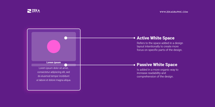
This is a weird piece of advice. White space, in this case, is not literally white space but negative space. Pockets of areas in your graphic design that are blank or empty. It is always better to do less than to do more. Clutter in your design will take away focus from your content. It is ok to leave white space in your design because it makes your body text easier to read and visually, almost always, is a better choice. You can jazz it up with some line designs or well-placed borders around your text.
8th Tip To nurture the Graphic Design skills – Research:
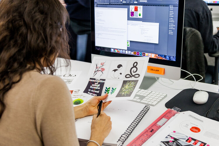
Research and study are always good. In the case of designs, take time to read up about your client’s company. This will give you insight into the company’s previous designs, and you can get some inspiration while you’re at it. From your research, you can also decide if there are any improvements to be made. Find resources for your designs, sites, typefaces, facts, whatever you might deem necessary. In the end, your design will be more thought out.
9th Tip To heighten up Graphic Design expertise – Moodboards:
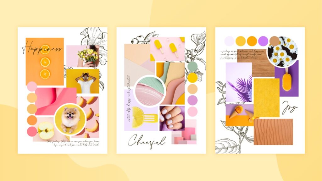
Mood board is a visual tool, i.e, it is a collection of “collage” of images, typefaces, color schemes all put together in one place, this is done to decide the overall aesthetics of a project. Mood boards help you visualize your design, and you will get an initial idea of what your design will look like. It will also help you decide what resources you might need during your project. Creating a mood board can act as an anchor to your project; it will also help you communicate your ideas to your client much more efficiently.
10th Tip To Uplift Graphic Designing Mastery – Write it down! :
Inspiration can strike at any time, and you might not be in front of your computer when these opportune moments arrive. As much as you think that mental notes will help you, you are wrong.
Bonus tip 2: remember to take breaks now and then! Rest your eyes, go for a walk, eat something. Sometimes, all you need is a fresh perspective.
11th Tip To increase Graphic Designing expertise – The KISS principle:

KISS stands for “Keep it simple, stupid.” No, we’re not calling you stupid; it’s just what the principle is called. That being said, when in confusion, go simple. You can always jazz it up afterward.
Reducing clutter in your design is much more tedious than adding more elements. Remember your design fundamentals and make sure every element in your design serves a purpose.

