Application Answers: How Do I Make My Application More Responsive?
Sites and apps that don’t fit onto a variety of screens no longer rank high in Google Search.
Google announced in 2016 that it would index its search results via a smartphone app, Googlebot. Applications that still required users to pinch and zoom would be removed from the listings.
If you want to ensure that your applications work on a modern device, you must make them responsive.
Read on to discover what application responsiveness means and why you should include a flexible design. See how Angular’s FlexLayout makes it simple to display elements on mobiles, tablets, and desktops.
Discover how to make your web applications more responsive while improving your SEO.
Application Answers: How Do I Make My Application More Responsive?
What Is Application Responsiveness?
A responsive web app promotes a positive user experience (UX) regardless of the device.
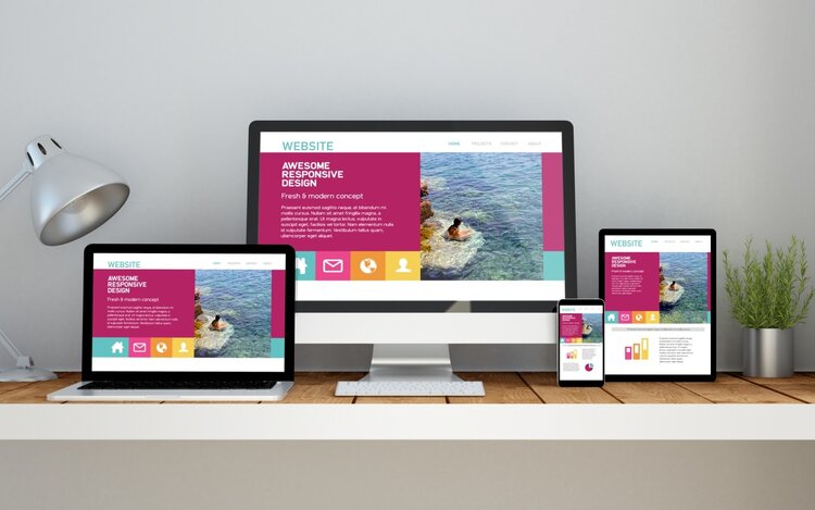
The user interface (UI) responds to the screen size, pixel ratio, and other factors to display content. For example, a mobile phone would hide the main navigation and reduce the size of images so that they fit the available width. A laptop provides a feature-rich experience as it has more space to work with.
App responsiveness is based on CSS media queries. These tell the browser what to display depending on specific rules that the developer dictates.
You can create as many rules as you want, and the browser will switch between them depending on the device’s setup.
Why Flexible Applications?
A flexible application offers multiple advantages, such as:
- Attracting more mobile visitors
- No longer having to maintain several sites for different screen sizes
- Consistent branding across your applications
Flexible and adaptive apps can also improve conversion rates by 10%.
Users no longer need to swap between their phones and computers as the experience is the same. They can log in to their account and won’t have to scroll to the side to read the content. Everything works ‘out of the box’.
Building Responsive Apps
When building responsive applications, first study CSS techniques like Flex and Grid.
They convert simple <div> tags into highly adaptive layouts without having to add extra code. That means you can convert an existing static website into a responsive site simply by altering the style sheet.
Adding the following tag to the top of the page tells the browser that the content is responsive:
<meta name=”viewport” content=”width=device-width, initial-scale=1.0″>
This ensures that the browser uses the entire width of the screen’s viewport and does not scroll past it. Content is scaled to fit this maximum size automatically.
App Responsiveness in Angular
Angular is a popular reactive framework that combines the power of the back-end server with a front-end UI. It also comes with several responsive libraries that you can plug into within seconds.
Import FlexLayoutModule and add the directive fxLayout=”row” to the parent <div> tag.
From there, you can edit the CSS to design the layout. If you change your mind, you can edit the code in one place—no more having to change the actual content!
Further Tips on Responsive Applications
A responsive application provides a flexible framework to display content on any size of screen or device.
App responsiveness plays a vital role in building web apps. Beware of hiring a development team that ignores these design principles. Use them to improve your users’ experience and SEO.
You can read more web application responsiveness tips on our website. Also, please let us know what you think of this article on social media.


