Ongoing design trends in digital business cards: What’s hot and what’s not
- 1 Trends that are hot right now
- 1.1 Minimalistic and clean designs
- 1.2 Dark mode aesthetics
- 1.3 Interactive elements
- 1.4 Personal branding and custom illustration
- 1.5 Sustained designed practices
- 2 Trends that are fading away
- 2.1 Flashy animations
- 2.2 Information overload
- 2.3 Stock visuals
- 2.4 Generic templates
- 2.5 Desktop-only designs
- 3 Conclusion
We live in a world where virtual handshakes are just as important as physical ones. To help with that, digital business card has emerged as a power player in networking and personal branding.
These little rectangle boxes of virtual real estate are not just for exchanging contact information; they are your virtual introduction, digital storefront, and brand’s first impression.
And just like any fashionista will tell you, staying in vogue is the name of the game. So, let’s explore the design trends in digital business cards. We’ll also see which trends are hot right now and which ones to avoid.
Trends that are hot right now

Minimalistic and clean designs
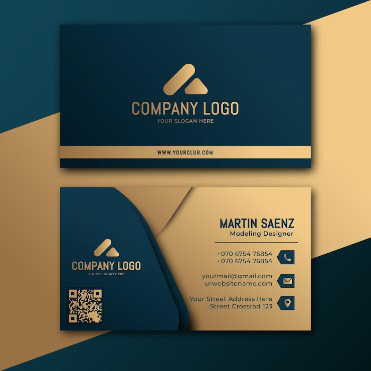
Gone are the days of visual chaos and sensory overload. The minimalist movement has made its way to the digital business card universe.
A sleek, decluttered design not only looks sophisticated but also enhances legibility. Think of crisp typography, plenty of white space, and just the right information.
These designs are like a breath of fresh air, which allows your recipients to focus on what truly matters – you and your brand.
A minimalistic approach to design has gained prominence for its elegance and efficiency. The power of simplicity lies in its ability to cut through the noise and deliver a clear message.
Dark mode aesthetics
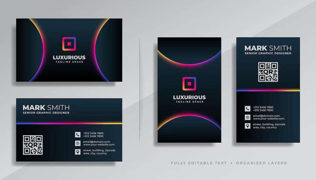
With dark mode interfaces becoming increasingly popular across platforms, it’s no surprise that this trend extends its elegant touch to digital business cards.
The benefits are clear: a dark background contrasts text and icons, making your information pop like stars against the night sky. So, don’t be afraid to embrace your darker side when designing your virtual calling card.
The dark mode isn’t just about aesthetics; it’s a functional shift that enhances user experience, particularly in low-light environments.
The soft text glow against a dark backdrop reduces eye strain and conserves battery life while offering a seamless browsing experience.
When applied to digital business cards with NFC technology, dark mode exudes a sense of modernity and sophistication, making your card stand out in a sea of conventional designs.
Interactive elements
Static was so yesterday. Today, it’s all about interaction and engagement. Imagine your recipient’s delight when they find clickable icons, playful animations, or videos introducing you and your brand.
These interactive elements inject life into your digital card to make the experience memorable and dynamic. It’s like turning your card into a story that your recipient will remember long after they’ve clicked away.
The digital landscape thrives on engagement; interactive elements are the perfect tools to spark that connection. Adding clickable icons will lead to your social media profiles or a portfolio showcase where you invite the recipient to explore more about you and your business.
Videos or GIFs provide a multimedia experience that words alone can’t convey. This trend is about transforming your business card into a mini-website, where each tap or click uncovers a new layer of your story.
Personal branding and custom illustration
Why remain ordinary when you can be extraordinary? Personal branding is not just for the big players but for everyone looking to make their mark.
Custom illustrations and icons that reflect your personality and brand values are a stellar way to stand out. They infuse creativity and individuality into your card, showing you’re not just another face in the digital crowd.
Your digital business card is a canvas to showcase your unique identity. Personalized illustrations and icons don’t just add visual appeal; they communicate your brand’s essence at a glance.
Think about how your brand’s values and story can be translated into visual elements. These illustrations act as visual cues, conveying messages that resonate beyond words.
We are playing is a ground where authenticity is prized; showcasing your personality through custom visuals is the secret sauce to creating a memorable and impactful digital card.
Sustained designed practices
When discussing ongoing trends, let’s discuss the classics that never go out of style. First on the list is mobile-friendliness. Remember, most interactions happen on mobile devices, so ensure your card is a pleasure to navigate on screens big and small. Responsive design is your key to making a lasting impression. Also, it is not a choice; it is a necessity.
Next comes privacy and security. Today, data breaches are as common as raindrops in a storm. Therefore, it’s essential to consider privacy concerns in your design choices. Limited display of personal information, encryption, and other security measures are a must to protect both you and your recipients. After all, no one wants to compromise their sensitive information.
And how can we not include consistency? Align your digital card design with your overall brand identity. Utilize brand colors, logos, and fonts to ensure your card seamlessly extends your broader brand presence. Consistency breeds recognition, and recognition breeds trust. Consistency isn’t about uniformity; it’s about unity. Your digital business card should be integral to your brand’s ecosystem. The colors you use and the fonts you select – should resonate with the larger narrative your brand is telling.
Trends that are fading away
As we ride the waves of ever-changing trends, it’s natural that some will recede into the sunset. In the above paragraphs, we’ve discussed the hot trends; now, we’ll talk about the trends that are fading away, and people don’t like anymore.
Flashy animations
Once the show stars are playing more of a supporting role, subtlety is the new showstopper. Purposeful animations that enhance the user experience without overwhelming them are the order of the day. Remember, it’s about complementing your content, not overshadowing it.
Information overload
Are you jamming your digital business card with every possible detail about your life and business? Sorry, but that’s a recipe for disengagement. Remember — less is more when it comes to information. Leave your recipients curious, not overwhelmed.
Stock visuals
Using common stock images is the quickest way to tank your digital credibility. Your business card reflects you – it should be uniquely yours. Moreover, what would the recipient think? You can’t even take a few good pictures from your smartphone’s high-quality camera.
Generic templates
Stop using those generic, cookie-cutter templates that make your digital business card look like everyone else’s. Your card is your first impression; if it is as memorable as yesterday’s lunch, you’re missing out on a golden opportunity to stand out in a crowded digital place.
Desktop-only designs
Designing a digital business card that shines on a desktop but crumbles on a mobile device is like building a stunning mansion with no front door. It’s a missed opportunity, plain and simple. So, put on your mobile mindset and make sure your card looks stellar on all devices.
Conclusion
And there you have it, a whirlwind tour of the hottest design trends and the ones that are gracefully bowing out.
Remember that your digital business card represents you and your brand, so choose a design that resonates with your essence and values. Whether you’re drawn to the minimalist allure, the enigmatic charm of dark mode, or the dynamic engagement of interactive elements, the choice is yours.
At last, keep in mind that your business card is not just a piece of virtual real estate; it’s a gateway to your world. Stay trendy and authentic, and let your digital business card talk.


