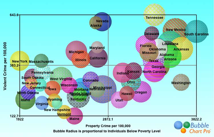
In today’s data-driven world, visual representation of information has never been more crucial. Visual data, such as charts and graphs, allow businesses to more effectively communicate complex data sets, ideas, or concepts. One such tool that is gaining popularity in the business world is the bubble chart. Below we’ll delve into how to make the most of this tool in a business context.
The Invaluable Role of Bubble Charts in Modern Business
Contemporary business environments are rife with complex data sets that require insightful interpretation. Achievement of this task is greatly facilitated by the adoption of visual data tools such as the bubble chart.
Bubble charts are unique as they utilize a three-dimensional approach to visualize data. This utilitarian feature allows businesses to convey multiple series of data concurrently, promoting comprehensive data understanding.
For this reason, bubble charts are a preferred choice by several modern businesses dealing with multifaceted data. They effortlessly highlight relationships, reveal patterns or trends, and allow for the comparison of data sets that could have otherwise been daunting.
In essence, their contribution to effective data visualization in the business landscape cannot be overstated.
Why You Should Opt For Bubble Charts: Unveiling Their Unique Benefits
Bubble charts offer a multitude of benefits, contributing to their soaring popularity among businesses. One of the key advantages is their ability to represent three dimensions of data, thereby delivering a more robust view of the data landscape.
Furthermore, due to their nuanced presentation, bubble charts make it easy to identify relationships and patterns within the data. This promotes accurate and timely decision-making in businesses, which can significantly affect organizational outcomes.
Moreover, through the efficient use of color and size aspects, bubble charts offer a high level of customization. This flexibility makes them versatile for varying data types and usage scenarios.
Accordingly, these unique attributes make bubble charts a worthwhile investment for any business seeking to elevate its data visualization.
Diving Into Bubble Charts: Essential Components and Their Functions
A bubble chart consists of three key components, namely, the X-axis, the Y-axis, and the bubble size. The X and Y axes showcase two distinct sets of numerical data, while the bubble size represents the third data set.
Additionally, bubble charts can incorporate colors to represent a fourth category of data. Each color signifies a different category, adding another layer of information to the chat.
This fundamental structure of a bubble chart, coupled with its ease of use and customizable features, sets it apart from other data visualization tools.
In using a bubble chart, businesses can effectively represent multiple data series simultaneously, facilitating extensive data interpretation and analysis.
A Step-by-Step Guide To Creating an Effective Bubble Chart
Creating an effective bubble chart is a simple process that begins with data collection. Businesses should gather relevant data sets that align with their respective goals and objectives.
Next, the data is plotted onto the chart, with each data set allocated to the X-axis, Y-axis, bubble size, or color. Consideration should be given to ensure that the most crucial data is given the highest form of representation for optimal visibility.
Lastly, after the initial setup, the chart can be customized as needed. With the right balance of customization, a bubble chart can efficiently encapsulate complex data in an easily digestible format.
Altogether, bubble charts offer a unique, versatile, and powerful way to visualize complex business data. Enterprises adept at utilizing these tools stand to gain unmatched insights and clarity in their decision-making processes.
